 This is a table runner I made last spring. I would have made one more star, but I really liked the light blue background and didn't have enough! And, to keep it scrappy, here's a closeup of the center:
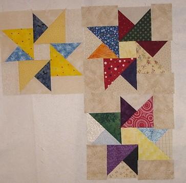
I also spent all afternoon yesterday playing with the Labor Day Madness blocks. Just did what I call "mindless stitching" which is chain piecing all the parts. I put two together trying out different centers and background fabrics and decided upon using all yellow centers and I "think" the darker background fabrics. Definitely going to weed out the lighter star points -- didn't like how they tended to fade into the background. Still need to square up about 80 parts today and play some more!
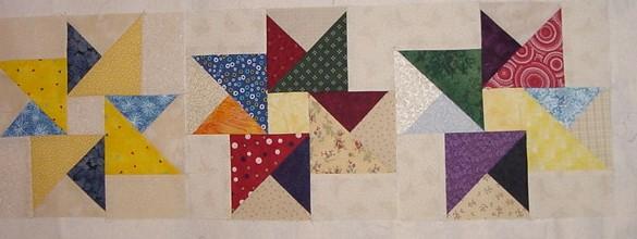 These are the blocks with the lighter background rectangles and the yellow squares.
And the ones below, I changed the background rectangles to a darker beige (they are not sewn in -- just pasted on top! So, what do you think? The lighter backgrounds or the darker? The centers of the blocks will still be scrappy, and the lighter points will not be used -- just don't show up that well. I like the darker scrappy look!
5 comments :
I agree - the darker background looks better.
Show us more!
Sarah N
Thanks for sharing your stars! I am partial to a slightly darker background with scrappy quilts. Jen
Thanks for your comments! I played some more today making more blocks -- if I get a chance I'll post them soon!
Joanne
Oh..me too..*S* I like the contrast that the darker background makes..and I love the scrappiness of them. Keep up the good work.
Love those blue stars and I'm a darker background kind of girl - so I also vote for the darker!
Post a Comment