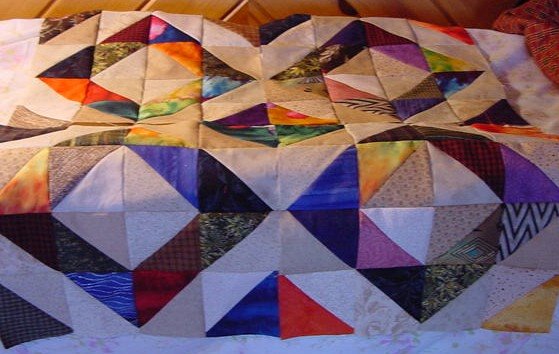
Anyway -- here's the Depression Blocks I made yesterday -- four of them and when put together, they form a negative (or opposite) block in the center. I really like that. The colors are lighter than they really are, I think -- I used a lot of tans/beiges as my backgrounds.
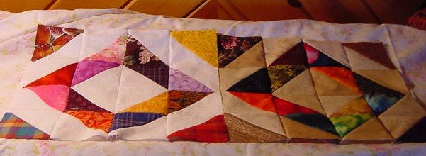
So today as I was doing the borders on Tulip Farm, I made hst's as leaders and enders. Only, I used WOW's for the background fabrics. So, here's one of each of the blocks side by side. Which do you like better?
I'm a dark, country fabric usually, folk art, primitive. But more and more I seem to be gravitating towards the lighter/whites as backgrounds in my scrappy quilts. I think they are more universally liked. I think my kids would all pick the lighter backgrounds in quilts.
I'm going to have to replenish my supplies of off-white/cream colors in my stash. I have a lot more white on whites and tans. I'm going to make more of the lighter blocks for now -- I'll probably end up with a quilt of each!
Gratitudes
1. Steak for dinner -- it's a treat and I love having it at home more than at a restaurant!
2. My daffodils are almost ready to bloom.
3. Actually accomplishing something in the sewing room today.
4. JR curled up at my feet no matter where I am.
5 comments :
You have been so productive the last few days. My address is.....when are you sending me the Tulip Quilt? I think I like the lighter bkgd on the depression blocks, makes the colors pop.
I am a fan of the lighter colored backgrounds too...but then, I am a brights kind of gal.
I normally like the darker colors for the backgroud. But your right - the lighter looks better for these blocks!
I like both... (I might even try to mix them together with in the blocks!) But if "I" had to choose one, I would choose the lighter one. - the pattern really POPS with the higher contrast.
I like them both for different reasons. If you want a "depression" look or aged quilt, then the darker one is better, but I agree that most people will like the lighter one better. And I love the way the colors go around!
Post a Comment